Home › Forums › ART WordPress Theme › unwanted space footer
- This topic has 43 replies, 2 voices, and was last updated 2 years, 9 months ago by
artsomething.
-
AuthorPosts
-
October 3, 2023 at 9:03 am #30042
Hello,
I have an unwanted space on the portfolio pages at the bottom. Everything is supposed to feet in the screen. Even if I can turn off the footer, it’s still here.
Please find a screenshot with a red rectangle where is the unwanted space.
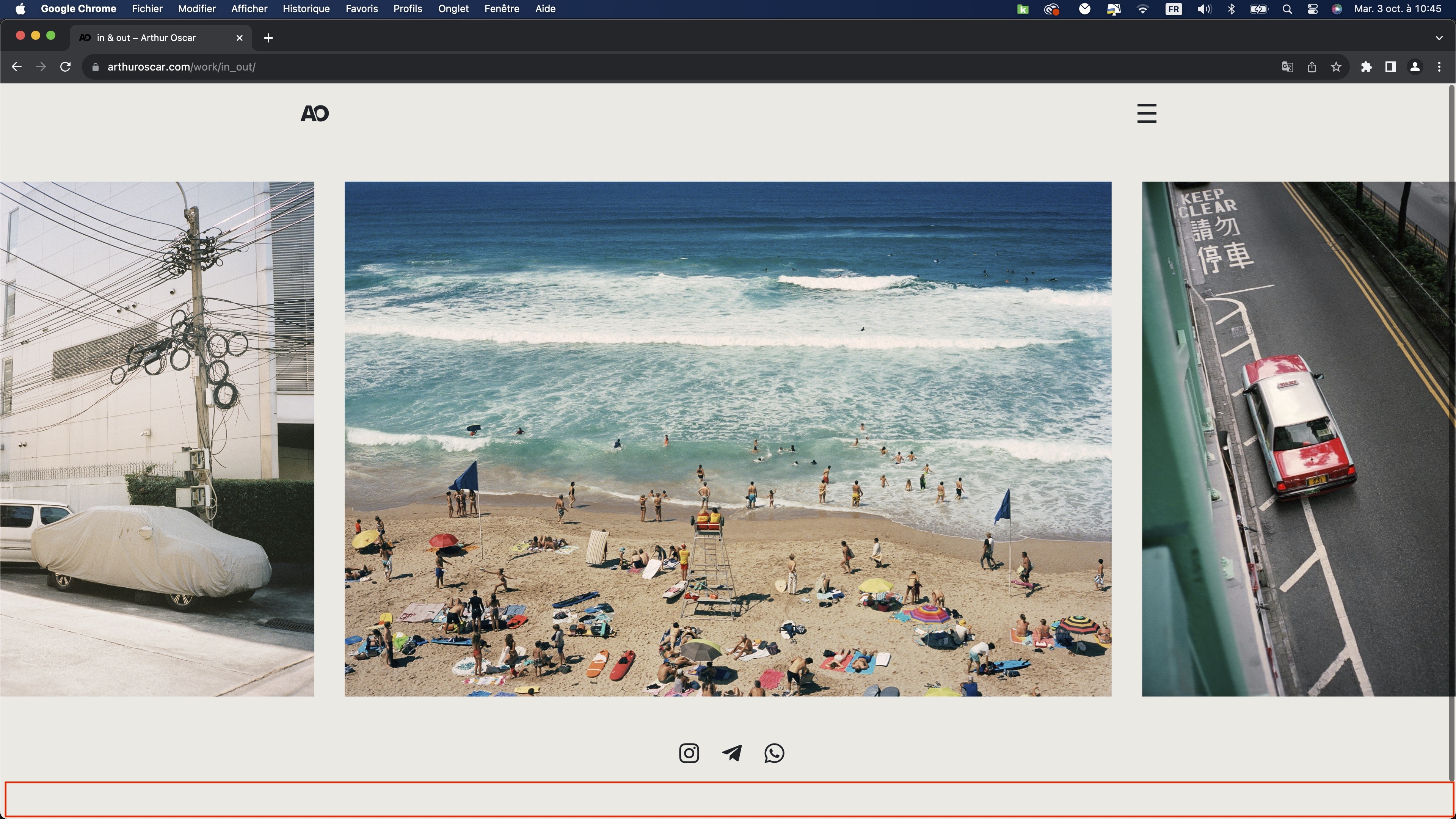
example of portfolio page : https://arthuroscar.com/work/in_out/
thank you
October 4, 2023 at 11:17 am #30048Hi,
Please paste the custom CSS code to “Appearance > Customize: Additional CSS”:
.wrap-all {
    min-height: 90vh;
}
Regards!
SeaTheme – FAQs – WordPress Customization – FacebookOctober 4, 2023 at 11:29 am #30051sorry it’s not working and it’s even creating a problem on the expanded panel. It’s cropping the bottom of the expanded panel.
October 4, 2023 at 11:42 pm #30053Hi,
has this page been changed? This issue cannot be reproduced now.
Do you have a new page link?
Regards!
SeaTheme – FAQs – WordPress Customization – FacebookOctober 5, 2023 at 3:23 pm #30059I put it again. The problem is everywhere on the website but please find the link of my example
https://arthuroscar.com/work/in_out/October 6, 2023 at 2:29 am #30062Hi,
Yes, it will crop menu panel, please remove the CSS:
.wrap-all {
    min-height: 90vh;
}
I am looking for another solution to fix the footer spacing issue.
But I cannot reproduce it for now, check the video https://www.dropbox.com/scl/fi/stlbowo2w4jw8uqswzkoh/20231006-footer-issue.mp4?rlkey=9gusqevt6pu8953rd5t05bycm&dl=0
Regards!
SeaTheme – FAQs – WordPress Customization – FacebookOctober 6, 2023 at 5:34 am #30068Ok I remove it.
Because you are on the mobile version. My problem is on the desktop, or on a tablet but in landscape mode.
October 6, 2023 at 8:16 am #30074Plz try adding the following CSS to see if it fixes the issue:
#content_wrap {
    margin-top: 0px;
}
Regards!
SeaTheme – FAQs – WordPress Customization – FacebookOctober 6, 2023 at 9:25 am #30075thank you, it’s a good beginning. it’s partly working but :
1- it’s creating a problem on the home page.. the background is becoming white until you scroll down and it changes blue which is normal but the white part is not
https://arthuroscar.com/home/2- on the portfolio pages it’s almost perfect on the computer, just the content is not centered anymore.
3- on my iPad the problem is still the same in landscape mode
sorry
October 7, 2023 at 2:30 am #30082Thanks, please remove the CSS:
#content_wrap {
    margin-top: 0px;
}
Add the CSS as:
@media (min-width: 991.98px) and (orientation: landscape) {
   .postid-14935 #content_wrap {
      margin-top: -20px;
   }
}
The CSS would affect https://arthuroscar.com/work/in_out/ page only. If you still have problems, let me know your monitor resolution and paste a screenshot of that page again. Thanks.
Regards!
SeaTheme – FAQs – WordPress Customization – FacebookOctober 7, 2023 at 6:02 am #30083sorry the problem is still the same on the home page with the new custom css and it change nothing on the “in & out” page.
+ I would have to add this code changing the id for 50 pages and all new portfolio pages I’m creating.
My resolution is 2880 x 1400 on a mac book pro 13 but most of the time I’m connected on the 24 screen.
My opinion is :
When you have a portfolio page, you have the option to turn on or off the footer. I don’t have a footer on my website. With your custom css, and also the one, if I turn off the footer I can see the space disappear.
Without the code I can turn off, the space and it’s still here. Maybe the problem is coming from the footer. Maybe a custom css saying on portfolio pages, the footer is 0 px or even not loading. I think your button was made for this at the beginning. I have the impression it makes the content of footer invisible but not disappear the space of the footer. October 8, 2023 at 1:35 am #30084
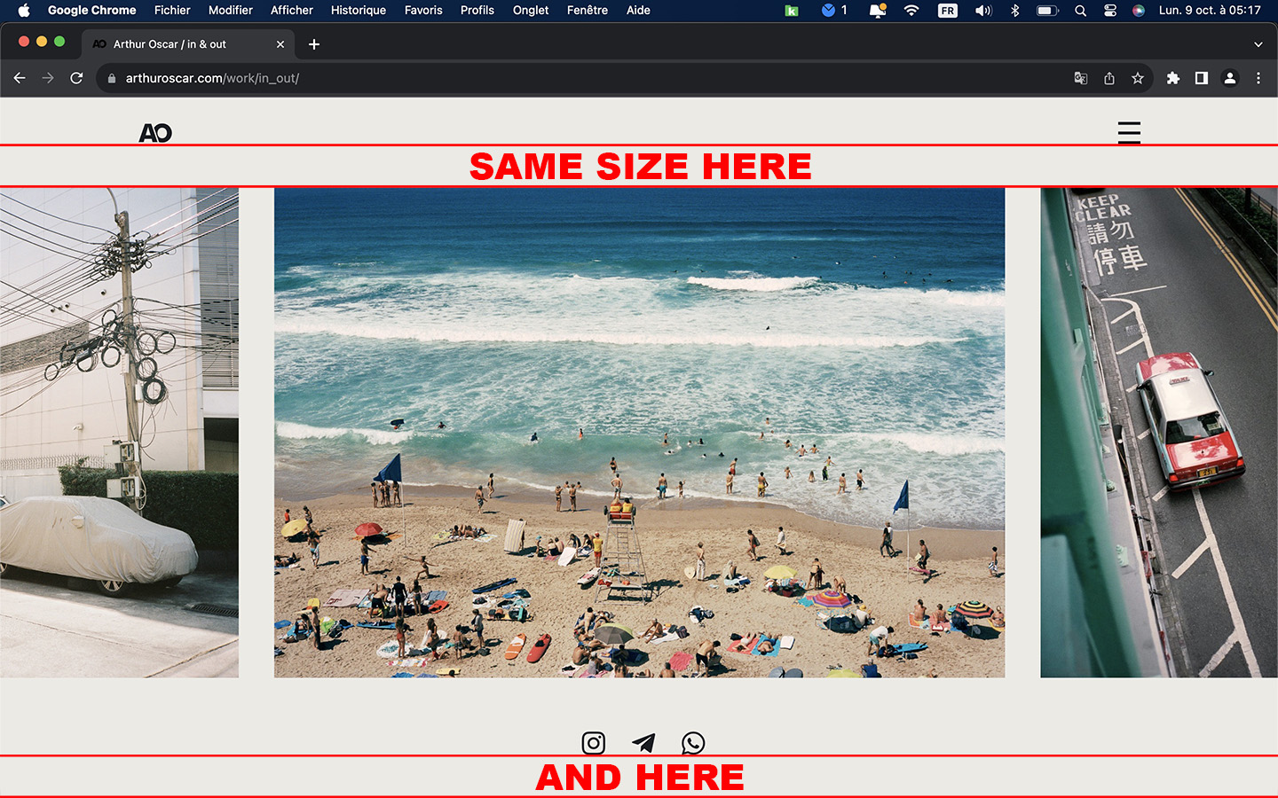
Hi
This issue is not caused by the Footer area, the Footer HTML element on this page is not outputting to the webpage at all. It should be caused by this issueThe height of the content area of this page is not flexible. If the height of the content area (check the screenshot the red box is the content area) plus the height of the Header bar if smaller than the height of the window, the bottom of the window will naturally have a spacing. Here’s a solution, using this CSS, you can make the height of the Social icon area flexible as well. Please test the “in & out” page first.Update the above CSS as:
@media (min-width: 991.98px) and (orientation: landscape) {
   .postid-14935 #content_wrap {
      margin-top: 0px;
   }
 .postid-14935 .bm-builder>div:last-child .group-inside{
   height: calc(30vh - 180px);
  }
}
ps: Are all Portfolio pages the same layout as this one?
Regards!
SeaTheme – FAQs – WordPress Customization – FacebookOctober 8, 2023 at 6:42 am #30085sorry it’s style the same and still have the problem on the homepage because of this custom css
Yes all porfolio pages as the same layout with a mobile version inside because this layout is not a good for mobile.
October 8, 2023 at 6:54 am #30086Hi,
Please check if the cache is purged. The CSS is set with a post ID, it should only affect “in & out” page first.@media (min-width: 991.98px) and (orientation: landscape) { .postid-14935 #content_wrap { margin-top: 0px; } .postid-14935 .bm-builder>div:last-child .group-inside{ height: calc(30vh - 180px); } }
Regards!
SeaTheme – FAQs – WordPress Customization – FacebookOctober 8, 2023 at 6:58 am #30087I’m checking all the time in private navigation and I also tested after purge the cache
October 8, 2023 at 7:40 am #300881. Is the homepage > https://arthuroscar.com/home/ ?
What is the issue if added the custom CSS?
You can remove the above CSS to check if there is the issue.2. Does the CSS fix the [in & out] page?
Regards!
SeaTheme – FAQs – WordPress Customization – FacebookOctober 8, 2023 at 7:49 am #300891. Yes it’s. All the white part background appeared with the custom css of the in out page.
When I erase the code the home page is correct again.
The white background has normally the same color as the header and when you scroll down at a moment the background turns voluntarily blue.
2. No the content is not centered vertically 🙁 in the page
October 8, 2023 at 8:02 am #30090October 8, 2023 at 8:06 am #30092This reply has been marked as private.October 8, 2023 at 8:18 am #30093Hi, I erased the CSS codes now, please check if the homepage works.
Regards!
SeaTheme – FAQs – WordPress Customization – FacebookOctober 8, 2023 at 9:01 am #30095I checked on my phone on private navigation and there is still the white space
October 8, 2023 at 11:10 am #30097October 8, 2023 at 2:17 pm #30099No the homepage is still not correct now.. Yesterday or the day before when I make the test without the code. I’m almost sure it was working well.
Because now even if I erase all the custom code, I still have the problem on the homepage.
Did you make something else?I found a partial solution for the unwanted space, I did few things
1. I clean the custom css I removed this part
/* content top */
#content_wrap {
margin-top: 50px;
}
@media (max-width: 767px) { /*for mobile*/
#content_wrap {
margin-top: 25px;
}
}2. I will do it on every pages but for example on the in & out page
– I put the social icons into the group with the slider
– I change the fluid height of the group to 90%
– I change the fluid height of the slider to 70%Which is almost permit to center the content, we can say on desktop it’s working like this and I will change on every pages.
On my iPad a 11 pro, it’s too big and there is still the unwanted space at the bottom.
If I reduce a lot for the computer if it’s ok for the iPad but it’s not the solution for me.October 9, 2023 at 1:39 am #30101Hi,
1. I just removed the below CSS:@media (min-width: 991.98px) and (orientation: landscape) { .postid-14935 #content_wrap { margin-top: 0px; } .postid-14935 .bm-builder>div:last-child .group-inside{ height: calc(30vh - 180px); } }2.
Which is almost permit to center the content, we can say on desktop it’s working like this and I will change on every pages.
Plz do not change all other single portfolios for now. It could probably be solved in a simpler way. I’d start by getting a more accurate idea of the requirements.
By centered do you mean the entire content area is centered or just the social icons? Please better post you a screenshot of the correct layout you want.On my iPad a 11 pro, it’s too big and there is still the unwanted space at the bottom.
If I reduce a lot for the computer if it’s ok for the iPad but it’s not the solution for me.Does this refer to ipad or iphone?
Regards!
SeaTheme – FAQs – WordPress Customization – FacebookOctober 9, 2023 at 3:38 am #30102On the bm builder, the background color is the good one and no white bug appears.
Then I tested few things for the home page to understand better the problem :
– If I turn on the option for static color of the page and I put any color : the white bug is still here.
– If I turn on “change universe color when I scroll in” and put the same color as the background it’s working.So it seems the background is not loading after the header until the moment I have a group with a universe color changed as all the rest of the page. It would be great to understand what happens.
If we don’t find anything I can still change universe colors for the beginning of the page. But it’s not the best solution as is there a bug behind.2. Yes I mean all the content area, I did a screenshot and a photoshop

It refers to the iPad
Iphone :
portrait mode : mobile version
landscape mode : mobile versionIpad :
portrait mode : mobile version but for the moment it’s the desktop version with the slider which is not the best for users
landscape mode : desktop version (because at this moment it’s the same screen condition as a computer)I hope everything is clear, I woke up in the middle of the night to answer you 🙂
October 9, 2023 at 3:39 am #30103sorry wrong link for the last answer
 October 9, 2023 at 2:17 pm #30105
Thanks.
Let’s solve the problem one by one, first solve the [unwanted space bototm] problem. I have made some settings on this page. Please check the desktop device to see if there are any questions. If you still have any questions, please send a screenshot. Thank you.
Regards!
SeaTheme – FAQs – WordPress Customization – FacebookOctober 9, 2023 at 2:32 pm #30106Sorry but my solution was working better for the moment
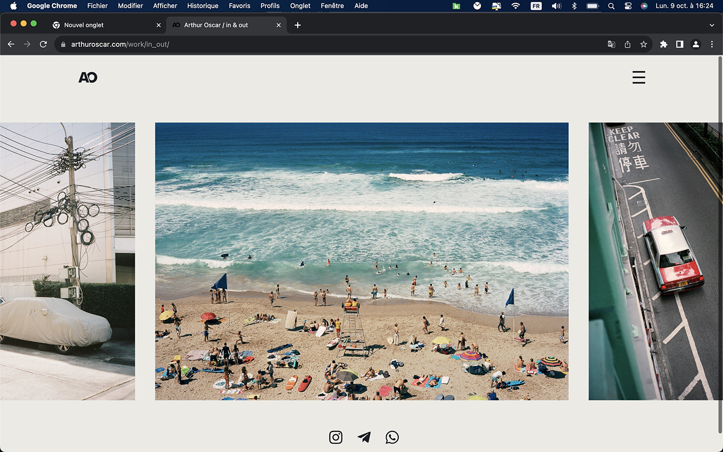
Your solution is almost okay on my 24 screen for example. There is a difference of 10 pixel less at the bottom.
But if I just check on my 13 mac book pro it’s almost as it was as the beginning and I have again the unwanted space bottomAs you can see before the content there is a huge space and almost nothing after the social logo
 October 9, 2023 at 4:09 pm #30109
Thanks,
I’ve tweaked it a bit more, please check again.
BTW: The page scroll bar is not wanted, is it?
Regards!
SeaTheme – FAQs – WordPress Customization – FacebookOctober 9, 2023 at 4:20 pm #30110I see you are trying everything. Equal spacing is not working, I tried a lot on sunday but nothing to do in my case.
You finally put again middle, which is better but the space between the content and the header is too big compared to the footer + between the slider and the social logo too small.
I don’t want to make you lose your time I think my settings were pretty good even it’s not perfect, it’s okay:
group at 90% and not 100% of the screen
slider 70%
and social logo top spacing 50the scroll bar is not wanted because there is no supposed to be there, it’s only here when this unwanted space appear. Which is not the case on the computer with your last settings and mine
I prefer you to be focus on the other problem
October 9, 2023 at 9:17 pm #30111https://arthuroscar.com/work/portraits/
To show you, I change it on the page. I also reduce the heigh of 10px. It’s work well on the macbook pro 13′ and also on the screen 24′. there is no unwanted space at the bottom so no scrollbar.
But It’s sill not good for the iPad screen. It’s a bit too big : unwanted space at the bottom and scroll bar are back.October 10, 2023 at 1:44 am #30114Hi,
Ok, I checked the BGcolor issue, it‘s caused via the CSS:
body{background-color:transparent!important;}It’s added to solve the iOs Safari bottom bar(mentioned another ticket)
The current solution is to enable this CSS only for pages that have a special background color set (like this page)
body.postid-18904{ background-color:transparent!important;}f there are other pages that are set to a specific background color, update the CSS like:
body.postid-18904,
  body.postid-xxxxx,
 body.postid-yyyyy {
   background-color:transparent!important;
}
Regards!
SeaTheme – FAQs – WordPress Customization – FacebookOctober 10, 2023 at 2:37 am #30115It seems to be okay now. Thank you
Yes there are other pages but I just checked and everything is working on it and I’m not even sure to keep the special background color set on it. Let’s stay like this and if I need I will add the id.
Now to go back on the on “unwanted space footer”.
On the iPad I still have the problem on landscape mode, as I was saying the content is too big for the iPad version.
There are settings for desktop and mobile but not for tablet except for the fonts.I would need to have the “desktop version” on the iPad when it’s Landscape mode.
But to have the mobile version when it’s in Portrait mode.Even on the expanded Panel of the iPad, I have this problem with the scroll bar. It considers the screen is bigger.
thanks a lot
October 11, 2023 at 1:39 am #30117Plz try to use the CSS to define a smaller height :
@media (max-width: 1280px) and (orientation: landscape) {
 .module-id-1663687806587 .slider-mod-wrap.slider-style3,
 .module-id-1663687806587 .slider-mod-wrap.slider-style3 .owl-carousel .owl-item img {
    height: 60vh;
 }
}
Regards!
SeaTheme – FAQs – WordPress Customization – FacebookOctober 11, 2023 at 3:01 am #30119sorry I don’t see any difference
and If I have to do this way with the module id, I will have to do this for more than 50 pages.
If there is a way to say “on portfolio pages, slider looks smaller of 20%” it would be a great solution. I know it looks too easy like this.October 12, 2023 at 4:23 pm #30126I still need to check your site, this might be a faster way to do it, is that ok?
Regards!
SeaTheme – FAQs – WordPress Customization – FacebookOctober 12, 2023 at 5:13 pm #30127This reply has been marked as private.October 13, 2023 at 6:27 am #30128Thanks
If there is a way to say “on portfolio pages, slider looks smaller of 20%” it would be a great solution. I know it looks too easy like this.
I added custom JS(Custom JS & CSS) to set slider height as 55vh for ipad
Regards!
SeaTheme – FAQs – WordPress Customization – FacebookOctober 13, 2023 at 8:04 am #30130i just checked, the slider is smaller but it doesn’t change the size of the group content , so at the end I still have the scrollbar with the empty space because it thinks the screen is bigger than the reality.
Even the expanded panel has a scroll bar which is not the concept for sure.
I think if we can have the mobile version on the iPad for landscape and portrait mode, make something for the scroll bar on the expanded Panel of the iPad it would be good. And I will stop to ask your help for a moment 😉
thank you
October 14, 2023 at 3:14 am #30136Please try to decrease the Group height(80vh or less) to check the scrollbar is disppear. Let me know the result. Thanks
Regards!
SeaTheme – FAQs – WordPress Customization – FacebookOctober 14, 2023 at 7:21 am #30137I try even at 50%, the scrollbar is stil here. the content is really much smaller, big space at the bottom but same problem.
Don’t worry about this, if for portfolio pages on iPad I can have the mobile layout for landscape and portrait it’s perfect.
And if we can just fix the scroll bar on the expanded panel on the iPad landscape mode : perfect.I would be happy with this.
Just saying for a futur update it would be cool to have as you did for the fonts : some settings for the tablet or keep same layout on tablet ON / OFF
thank you
October 15, 2023 at 11:35 am #30141Hi,
I added the CSS, the scroll bar should be fixed
/*ipad scroll bar */
.single-ux-portfolio.iOS .wrap-all,
.single-ux-portfolio.iOS .group-inside.module-inside,
.single-ux-portfolio.iOS .menu-panel-inn
 {
min-height: calc(100svh - 80px);
}
PS:
I’ve been trying for hours and the ipad is currently not recognized as a MOBILE version. Apple set ipadOS as a tablet and I haven’t found a way to differentiate between ipad and tablet at the moment
Regards!
SeaTheme – FAQs – WordPress Customization – FacebookOctober 15, 2023 at 4:13 pm #30142it’s working great like this, no more useless scrollbar on the iPad. thanks a lot
Slider when you are in a vertical/portrait mode is not the best user experience. Can we just say when it’s in portrait mode it’s switching to mobile version or due to the size of the screen which is not large, we switch to mobile version
October 16, 2023 at 10:47 pm #30149Forget my message for the moment, I’m trying an other solution and I don’t to use your time for nothing.
thanks a lot
-
AuthorPosts
 WordPress Customization Service from
- You must be logged in to reply to this topic.