Home › Forums › Arnold WordPress Theme › Formatting Text Issue
- This topic has 5 replies, 2 voices, and was last updated 6 years, 1 month ago by
SeaTheme.
-
AuthorPosts
-
May 28, 2020 at 3:53 pm #21430
Hey,
I was wondering if you could help with two small formatting issues. Our site is pretty much done bar these couple of small niggles, 10/10 will buy many times over for new clients.Ok so… two links below should show what I mean. Mobile specific responsive issues. I want to widen my margins when on mobile only (more empty margin space left and right) and secondly change the appearance of the bottom image and client showcase. The bottom banner image shows the entire image, this I would rather display like the top banner where it shows perhaps 40%. Likewise with the client showcase I would rather it showed all 6 icons, rather than just one that can be swiped. (I tried without a container but it’s temperamental). This is no doubt simple CSS for you, if you could share I would greatly appreciate it!
To summarize that’s:
Margins on mobile when text beside an image on desktop is pushed underneath as shown in link 1
Link 1Bottom banner shown in 40% rather than entire width, and clients shown in 100% instead of individual shown in link 2
Link 2Spacing increased above text (push down from image) only on mobile, on desktop is fine but it’s too close when pushed underneath on mobile as shown in link 3
Link 3Cheers!
May 29, 2020 at 2:59 am #21442Hi,
1.
It is possible by custom CSS(“Appearance > Customize: Additional CSS”), like:@media(max-width:767px){ .pagebuilder-wrap>.container-fluid, .container, .col-xs-1, .col-sm-1, .col-md-1, .col-lg-1, .col-xs-2, .col-sm-2, .col-md-2, .col-lg-2, .col-xs-3, .col-sm-3, .col-md-3, .col-lg-3, .col-xs-4, .col-sm-4, .col-md-4, .col-lg-4, .col-xs-5, .col-sm-5, .col-md-5, .col-lg-5, .col-xs-6, .col-sm-6, .col-md-6, .col-lg-6, .col-xs-7, .col-sm-7, .col-md-7, .col-lg-7, .col-xs-8, .col-sm-8, .col-md-8, .col-lg-8, .col-xs-9, .col-sm-9, .col-md-9, .col-lg-9, .col-xs-10, .col-sm-10, .col-md-10, .col-lg-10, .col-xs-11, .col-sm-11, .col-md-11, .col-lg-11, .col-xs-12, .col-sm-12, .col-md-12, .col-lg-12 { padding-left: 30px; padding-right: 30px; } }The default padding is 20px
2.
It is not possible to show 6 icons on the mobile by simple quick CSS, it needs JS job.
To change the width by custom CSS:@media(max-width:767px){ .owl-carousel.clients_wrap { width: 60%; margin: auto; } }3.
@media(max-width:767px){
 div[data-post="20191106-180041-106"]{margin-top: 10px;}
}
Regards!
SeaTheme – SeaTheme.net – Twitter – Facebook
June 4, 2020 at 3:48 pm #21517This is ideal, the layout is now so much clearer than it was before. Thanks a plenty!
I leave you with but one feature request, and that is that on the mobile menu my structure is as follow;
What We Do>
Road Traffic
Criminal LawFor some reason even though there is still a page on ‘What We Do’ you only seem to to be able to navigate to the sub pages. It would be nice if when pressing ‘What We Do’ and being given the sub pages, do you want? > Road Traffic or Criminal Law, that the option of entering the main page was also available. Currently on mobile using that menu it seems impossible to access ‘What We Do’, no matter what I double press or try to work around.
OK thanks guys/girls,
Merci!
June 5, 2020 at 3:49 am #21521Hi,
For a menu item which set the child menu:
There is a solution:
Please go to Appearance>Menu, add the page “What We Do” again, make it under the existing “What We Do” like >> https://www.dropbox.com/s/z9f43uzfpkhtj3n/qq20200605-114535.jpg?dl=0To hide the new menu item “What We Do” on desktop by the custom CSS(“Appearance > Customize: Additional CSS”):
header .sub-menu .menu-item-1173 {display:none;}Best
June 9, 2020 at 4:59 pm #21555SeaTheme your the best! High quality support to match the theme,
This is quite rare,
Merci
June 10, 2020 at 2:20 am #21558Hi, you are welcome! We are happy to help you.
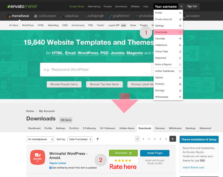
If you like the theme, please rate it on Themeforest. I would greatly appreciate :).
Please refer the screenshot to rate:
Best
-
AuthorPosts
 WordPress Customization Service from
- You must be logged in to reply to this topic.