Home › Forums › ART WordPress Theme › 4 Columns Grid bug on Chrome with high resolution screen
- This topic has 7 replies, 2 voices, and was last updated 7 years, 4 months ago by
SeaTheme.
-
AuthorPosts
-
March 16, 2019 at 11:34 pm #18035
Hi,
congratulations for the work on this theme.I’m having some trouble with a 4 columns grid (in BM Content Builder), with Chrome on a high resolution screen (Microsoft Surface). It works on Firefox, Edge and on others “standard” screens.
When I choose 4 columns on a grid, with a 12/12 width, I get sometimes 3 images on a line, a blank space and the fourth image on the next line. I don’t know how to avoid this.
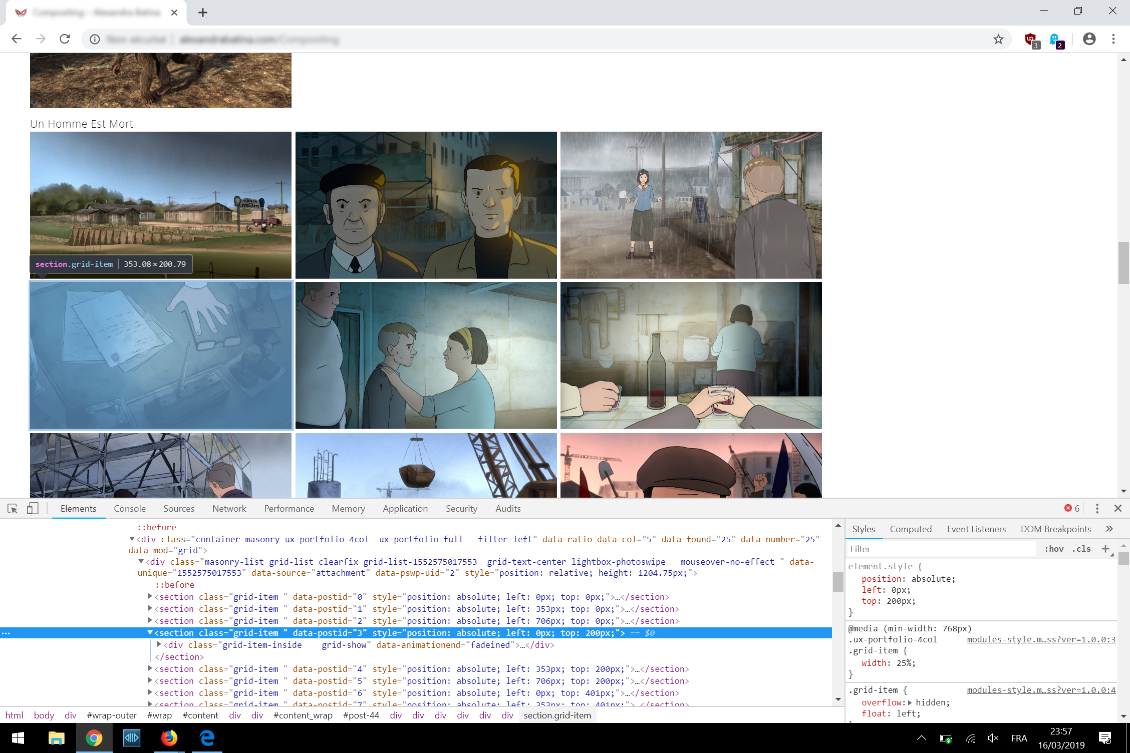
Here is a screen of what I get:
Thanks
March 17, 2019 at 1:16 pm #18036Hi,
Thank you for purchasing our theme.
Could you leave the issued page URL, I need to check it. Thanks!Regards!
Bwsm – Professional WordPress Theme Studio
uiueux.comMarch 17, 2019 at 2:01 pm #18037Thanks for your quick reply,
here is the URL: http://alexandrabatina.com/Compositing
It happens on a 2256×1504 Surface screen.
March 18, 2019 at 2:40 am #18039Hi
I don’t have the device to test. Please check if it fixed with this custom CSS.
Please paste the custom CS code to “Appearance > Customize: Additional CSS”@media (min-width: 768px) { .ux-portfolio-4col .grid-list { height: auto!important; display: flex; flex-wrap: wrap;} .ux-portfolio-4col .grid-list .grid-item { position: relative!important; left: 0!important; top: 0!important;} }Regards
March 18, 2019 at 9:41 pm #18043Hi,
I tried, and it works, but it disables the smooth/nice animation when resizing the window.
In place, the images from the grid go weirdly to bottom/right when resizing.
It’s not that serious, so for the time being I put this, in order to apply your code only on retina screens:@media (-webkit-min-device-pixel-ratio: 1.25), (min-resolution: 120dpi){ .ux-portfolio-4col .grid-list { height: auto!important; display: flex; flex-wrap: wrap;} .ux-portfolio-4col .grid-list .grid-item { position: relative!important; left: 0!important; top: 0!important;} }Thanks for your reply
March 19, 2019 at 1:13 am #18045Thanks for sharing.
Why apply it only for retina? I suggest you add(min-width: 768px)for@mediaalso.March 19, 2019 at 10:58 pm #18051I made the change only for retina because I’ve not this bug on normal screens, even on a dual screen (more than 3400 pixels of width).
With your patch, which makes thankfully the 4 columns working on a retina screen (anyway for Microsoft Surface), it makes strange movements on the images from the grid when resizing manually the window. But the important thing is that the 4 columns layout is now working.
However, there is no problem when choosing a 3 or 5 columns layout.
Best
March 20, 2019 at 3:14 am #18054Okay, thanks for sharing, I am not sure if it caused by retina screen. But I don’t have the Surface to test. We will check it further if we get new reporting.
-
AuthorPosts
 WordPress Customization Service from
- You must be logged in to reply to this topic.