Home › Forums › Arnold WordPress Theme › Image quality in lightbox
- This topic has 38 replies, 2 voices, and was last updated 9 years, 5 months ago by
SeaTheme.
-
AuthorPosts
-
January 28, 2017 at 11:11 am #11909
Hi,
I uploaded some images of 800 px in wide to my website. When I use those images in my post to show through the lightbox, they are shown blurred. The image size on my screen in fact is 800 px wide, but they are rendered from smaller resampled images. In inspectore there are both – the original 800 px wide and some smaller one, 650 px wide. But for lightbox is obviously used smaller version and therefore is the picture shown a bit blurry. Could be the lightbox rendered from original pictures?
January 28, 2017 at 12:10 pm #11910Hi,
The lightbox is a responsive plugin, if the screen view is big enough, it will show the origin size image. You could try to resize the browser window size, you’ll find the image will be fit within the window size. If you want it shown origin size always, in small screen, the image will be cropped, it doesn’t make sense.
Cheers!<br>
Bwsm – uiueux.com – Twitter – FacebookJanuary 28, 2017 at 9:37 pm #11917Hi,
I get the prinicple of lightbox, but I was just wondering that my images are shown in fact in size of their original dimensions (for example 800 px wide on my screen), but they are rendered to this size from some smaller ones (650 px wide). Even if I open those images on my 24” screen.
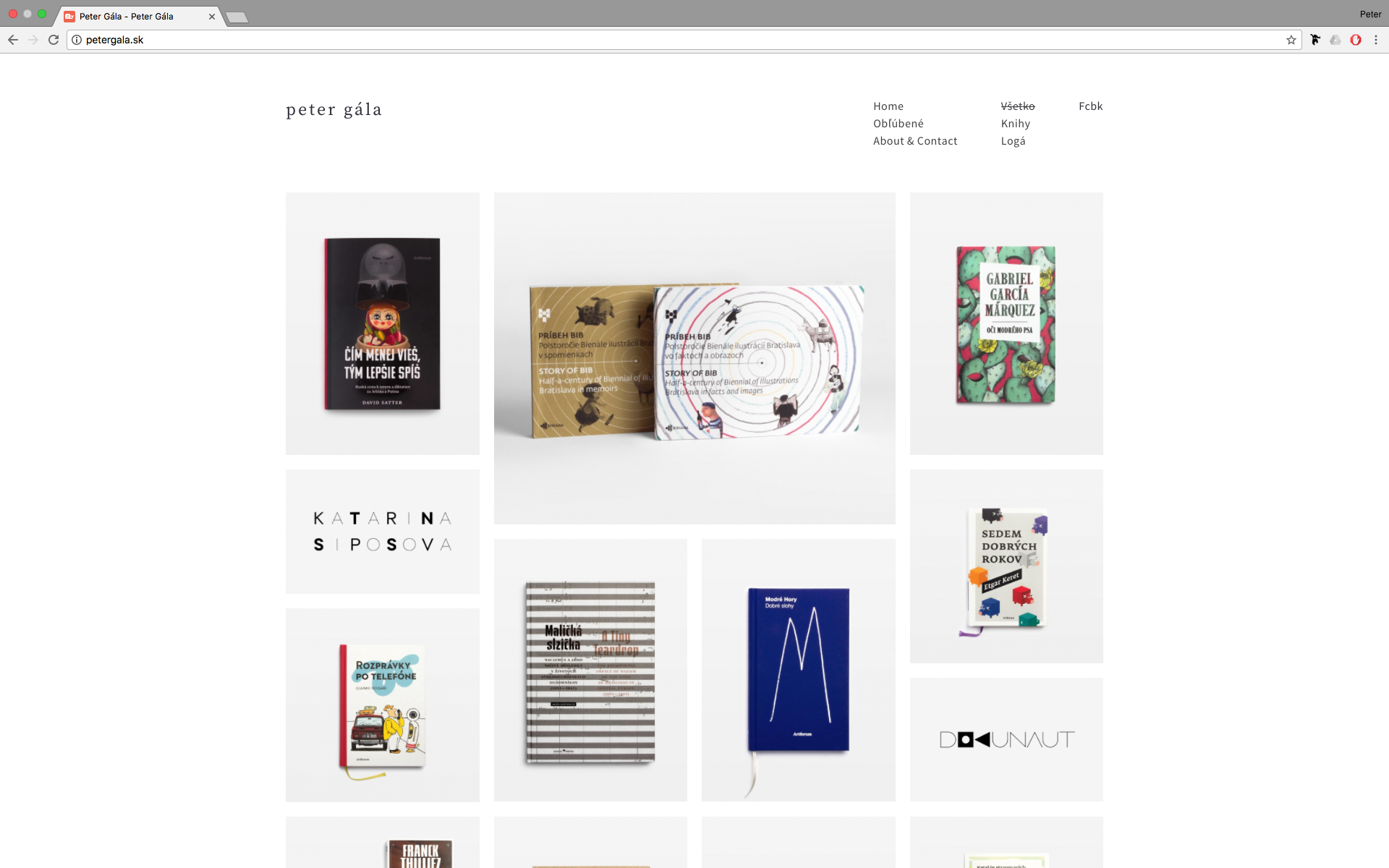
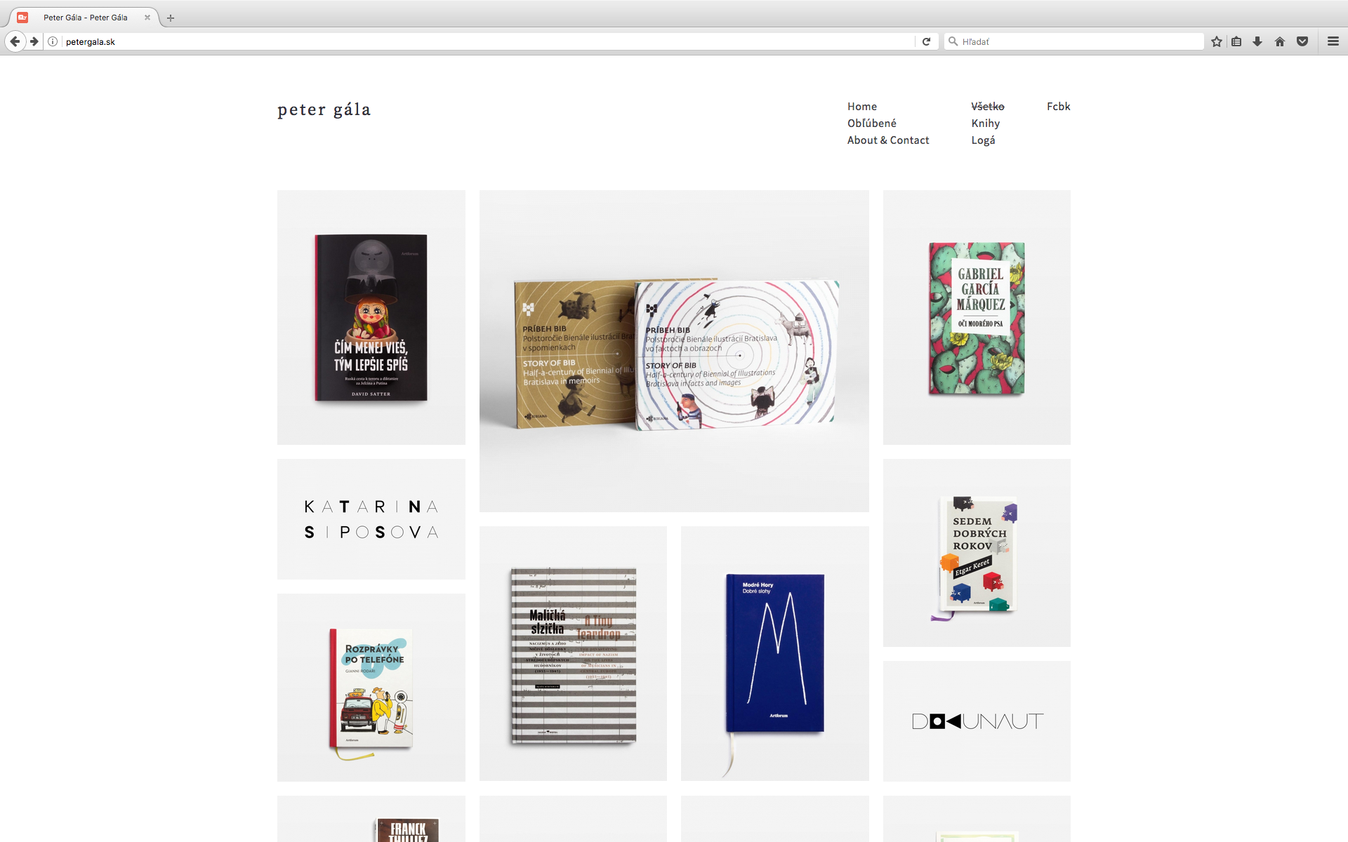
Update: when I open the same post with images in Chrome, all is working nice and images are razor sharp. And not only images in the lightbox, but all other at the webpage also. Even those in the Custom Grid Portfolio! (my homepage) In fact – my whole webpage looks much more blurry in Safari than in Chrome. In Chrome there is also nice function to zoom-in scaled images in the lightbox, which doesn’t work in Safari. Couldn’t be problem somewhere here? In the webbrowser?
January 29, 2017 at 4:49 am #11921I tested on Safari, it works find also:

What’s your device system name and version? The screen is retina? The safari version?
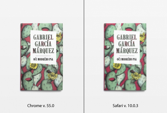
January 29, 2017 at 9:52 pm #11923That’s really weird.. My Safari is runing on a Mac OS X 10.11.6, version 10.0.3. Chrome (v. 55.0) and also Firefox are rendering all images nice and sharp. For comparison I prepared one picture to you. My screen has standard resolution, no retina.
January 30, 2017 at 4:51 am #11925Yes, it is weird, my Safari is 10.0.1, the image is sharp. I’ll find another non-retina mac to test again. I am focus on this problem. Let us be in touch if anything update.
FW: the screenshot you pasted is lightbox?FW: Is the Safari view within “actual size”(not zoom in or zoom out) ??
 January 30, 2017 at 8:28 am #11928
Thank you for your interest and focus. I’ll be waiting 🙂 Yes, my browser is in Actual Size view. The screenshot was taken from Custom Grid at the homepage, but the same behaviour also in lightbox and acros the whole webpage.
I tested this issue also on another computer (macOS 10.12.2; safari 10.0.2 / Chrome 55.0 / Firefox 51). Safari blurry acros the whole webpage but also Chrome – in lightboxes still sharp, but all another pictures at the page also blurry. Firefox again sharp across the whole webpage.
Weird..
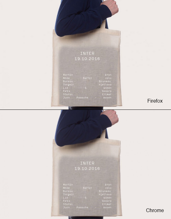
January 30, 2017 at 12:39 pm #11930I tested this issue also on another computer (macOS 10.12.2; safari 10.0.2 / Chrome 55.0 / Firefox 51). Safari blurry acros the whole webpage but also Chrome – in lightboxes still sharp, but all another pictures at the page also blurry. Firefox again sharp across the whole webpage.
In another, is blur on Chrome also?? What’s size screen of this computer?
FW: I did the test on no-retinale mac, it looks fine.Do you find the issue on the demo site: http://themes.uiueux.com/arnold
January 30, 2017 at 1:34 pm #11932My screen size is 1920 x 1200 (Apple Cinema 23-inch) but the same behaviour also on my MacBook 1280 x 800. Yes, the demo site looks the same way (Chrome vs. Firefox).
January 31, 2017 at 3:07 am #11933I tested this issue also on another computer (macOS 10.12.2; safari 10.0.2 / Chrome 55.0 / Firefox 51). Safari blurry acros the whole webpage but also Chrome – in lightboxes still sharp, but all another pictures at the page also blurry. Firefox again sharp across the whole webpage.
Is blur on Chrome in another mac?? or only blur on Safari?
Could you paste a fullscreen screenshot on Safari?
Thanks!
January 31, 2017 at 9:26 am #11934On my Mac Mini (macOS 10.12.2, 23” Apple Cinema Display) browsers look this way:
Safari fullscreen homepage (blurr)
Chrome fullscreen homepage (blurr)
Firefox fullscreen homepage (sharp)
Safari image in lightbox (blurr)
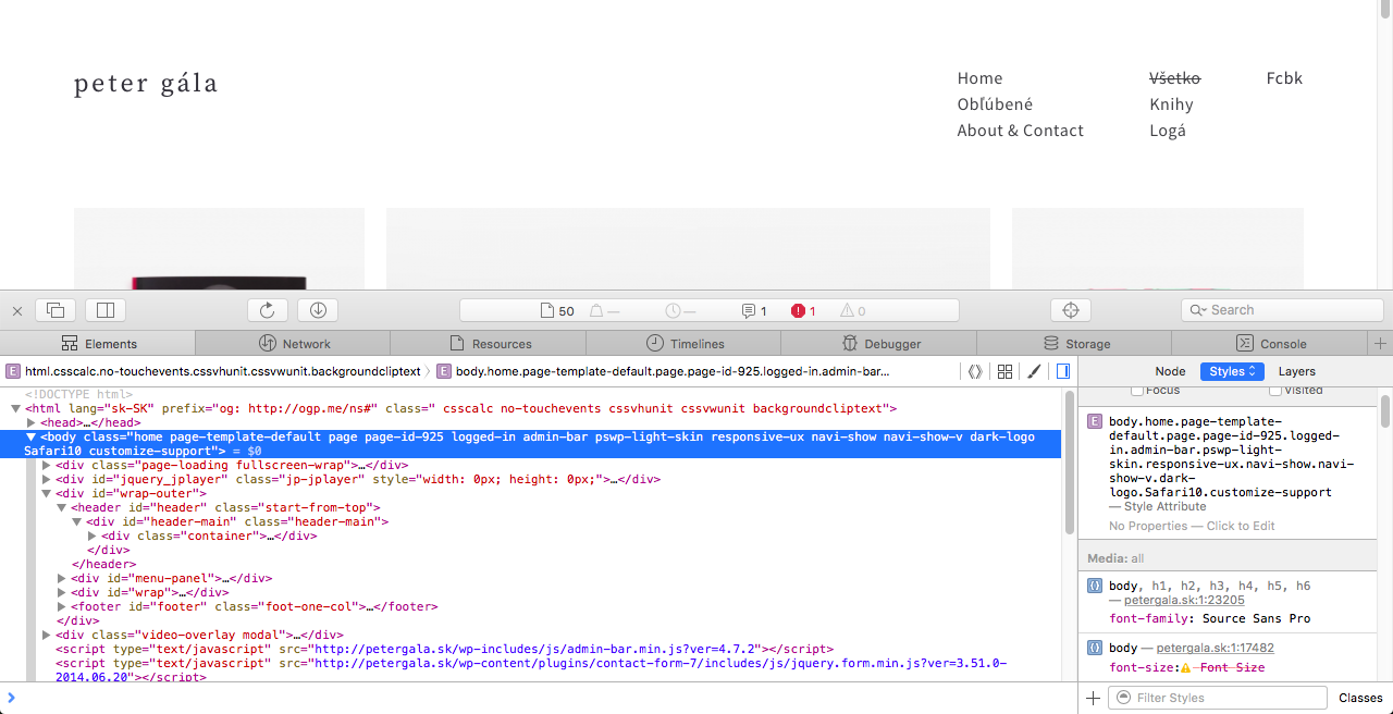
Safari image in lightbox with inspector* (blurr)Safari shows the image in lightbox in original size, as uploaded (900×600), but the quality isn’t the same as original. Chcome and Firefox ar in lightboxes sharp as the originals really are. But chrome is sharp on this Mac Mini only in lightboxes. Other images at the webpage are also blurr. But on my MacBook 13” is Chrome sharp across the whole webpage (Safari not).
*What I don’t understand is, that inspector labeled the img. with other (biger) dimensions as they are in reality (1076×717 vs. 900×600). You can measure the srceenshot yourself.
January 31, 2017 at 1:12 pm #11935On my Mac Mini (macOS 10.12.2, 23” Apple Cinema Display) browsers look this way:
Safari fullscreen homepage (blurr)
Chrome fullscreen homepage (blurr)
Firefox fullscreen homepage (sharp)I made some search for the issue, find this post: https://origin-discussions-us.apple.com/thread/7289942?start=0&tstart=0
I think it maybe a browser issue.
Please made a test: check for other site(like:http://www.pixeden.com/), use Safari / Chrome / Firefox to check if there is different for same page.
It is my test result under a big screen settings:
Normal Screen Chrome
Normal Screen Safari
Retina Chrome
Retina Safari
There is not different almost on Safari and Chrome, even the Safari is more sharp a litter on normal screen.January 31, 2017 at 1:27 pm #11937Safari shows the image in lightbox in original size, as uploaded (900×600), but the quality isn’t the same as original. Chcome and Firefox ar in lightboxes sharp as the originals really are. But chrome is sharp on this Mac Mini only in lightboxes. Other images at the webpage are also blurr. But on my MacBook 13” is Chrome sharp across the whole webpage (Safari not).
*What I don’t understand is, that inspector labeled the img. with other (biger) dimensions as they are in reality (1076×717 vs. 900×600). You can measure the srceenshot yourself.
The rule of lightbox is that the to fit the screen size. But it is not right that your reply:
(for example 800 px wide on my screen), but they are rendered to this size from some smaller ones (650 px wide). Even if I open those images on my 24” screen.
The image size should be bigger(1076px) in large screen, should not be less than origin size (like 650px) in large enough screen. My test result is 917px:

It is possible more large than origin size if screen big enough. I still don’t know why different with chrome / Firefox.Please make a test for lightbox of 900px image, add the code to Appearance / Theme Options / Custom Css,
It will force the image as origin size(only for 900px images) shown:.postid-1323 .pswp img { max-width: 900px!important; }Check if more sharp on Safari.
fw: This css only work for this page. You could remove it after testing.
January 31, 2017 at 7:49 pm #11942Yes, I think the same about your screens. Safari little bit better, but barrely visible.
I tested with custom css – with that code the image is deformed. Whenn I added also max-height: 600px!important;, the image is in origin ratio, but scaled down (shown less than 900 x 600) and still blurr quality.
It is possible more large than origin size if screen big enough. I still don’t know why different with chrome / Firefox.
I think, my 23” screen is big enough to show 900 x 600px image more bigger, but the image won’t be shown more than origin size (900 x 600). Even if I had 30” screen, the image will be (by me) still max 900 x 600. But blurr.
I went through the Apple discusion and it really seems to be hot and actual topic! Probably, we have to wait, the problem can by in browsers. But I wonder the principle is not the same by all webpages for particular browser. The page, you mentioned (Pixeden) is nice and sharp in all my web browsers! Even in Safari. Can you detemine something from this discovery?
February 1, 2017 at 7:18 am #11943I tested with custom css – with that code the image is deformed. Whenn I added also max-height: 600px!important;, the image is in origin ratio, but scaled down (shown less than 900 x 600) and still blurr quality.
Plz update the code as:
.postid-1323 .pswp img {
    max-width: 900px!important; height: auto!important;
}
I want to know if it is blur by the origin size image.
I think, my 23” screen is big enough to show 900 x 600px image more bigger, but the image won’t be shown more than origin size (900 x 600). Even if I had 30” screen, the image will be (by me) still max 900 x 600. But blurr.
The custom css will make the 900px image be only shown 900px max.
The page, you mentioned (Pixeden) is nice and sharp in all my web browsers! Even in Safari. Can you detemine something from this discovery?
Please check the url, it is lightbox of theme demo site
February 1, 2017 at 12:52 pm #11945With this new code the lightbox behaves strange. The size on my 23” fullscreen browser is smaller than 900×600 and by lowering the browser size the image comes to be (curious) bigger. See my screen. Or maybe try yourself. I left the custom code still alive. Within the smaller size the image is sharp in Safari.
Images in lightbox are shown 900px (to their origin size) max also without the custom CSS. Even if I have bigger screen. The original size is limitation for them. And I have nothing against that. It’s only a topic about the quality.
Please check the url, it is lightbox of theme demo site
In this lightbox there are images with wery small depth of field and hard to determine the sharpness. But I looked at this, and there are visible diference between Safari (blurr) and Firefox/Chrome (sharp).
February 2, 2017 at 5:43 am #11952Yes, the custom css doesn’t work. Please remove it.
Please use the custom css, check if blur for the lightbox image.pswp__zoom-wrap, .pswp__zoom-wrap img { -webkit-filter: blur(0px); -webkit-backface-visibility: hidden; -webkit-transform: translateZ(0) scale(1.0, 1.0); image-rendering: -webkit-optimize-contrast; }February 2, 2017 at 7:44 am #11953Nice! This piece of code works – images (but only in lightbox) are sharp in Safari.
I don’t know if it is normal, but with this code Safari is sharp, but Firefox the other way around – blurr (in lightboxes). When I remove (coment) the code, Safari is blurr back and Firefox sharp.February 3, 2017 at 3:24 am #11958It wired. the prefix
-webkit-can not be read on Firefox.Try update the css as:
body.Safari9 .pswp__zoom-wrap, body.Safari9 .pswp__zoom-wrap img, body.Safari10 .pswp__zoom-wrap, body.Safari10 .pswp__zoom-wrap img, body.Safari11 .pswp__zoom-wrap, body.Safari11 .pswp__zoom-wrap img { -webkit-filter: blur(0px); -webkit-backface-visibility: hidden; -webkit-transform: translateZ(0) scale(1.0, 1.0); image-rendering: -webkit-optimize-contrast; }February 3, 2017 at 7:30 am #11962Safari blurr, Firefox sharp
February 3, 2017 at 7:41 am #11963Please check your Safari develop tool, if there is the
Safari10in<body>tag?
Better paste a screenshot, thanks!
 February 3, 2017 at 7:59 am #11965February 4, 2017 at 7:54 am #11970
Try to update the css as:
body.Safari10 .pswp__zoom-wrap img {
    -webkit-transform: translateZ(0) scale(1.0, 1.0);
}
Please notice:
1. Clean the browser cache.If it not work,
1. remove “body.Safari10”.pswp__zoom-wrap img { -webkit-transform: translateZ(0) scale(1.0, 1.0); }2.Try to logout from WordPress admin, I noticed the in logged in status of the screenshot.
Try to check the url if sharp on Safari, I have added the css within demo site http://themes.uiueux.com/arnold/2016/11/03/hikeshi/#&gid=1&pid=1
February 4, 2017 at 11:51 am #11971Hi, your demo site is nice and sharp also on my Safari now. On my site – cashes are empty, I’ve loged out, tried both codes, and weird outcome: this or this post is still blurr (doesn’t matter which version of css is active), but this or this post and their images are positively affected and sharp in my Safari.
My question is also – do we affect only images in lightboxes, or on the whole webpage also? Because feature images in posts or images on my homepage for example there are still blurr in Safari (Firefox shapr). Like those in lightboxes from two mentioned blurr links above.
February 5, 2017 at 12:52 pm #11976If you remove the css, is this post lightbox sharp?
.pswp__zoom-wrap img { -webkit-transform: translateZ(0) scale(1.0, 1.0); }My question is also – do we affect only images in lightboxes, or on the whole webpage also? Because feature images in posts or images on my homepage for example there are still blurr in Safari (Firefox shapr). Like those in lightboxes from two mentioned blurr links above.
I need to know if this code works firstly. If it works, I’ll try to test for another page. It it doesn’t work, I’ll try to test other css codes.February 5, 2017 at 6:04 pm #11977No, it isn’t. Without the code my lightbox images are blurr.
February 6, 2017 at 1:14 am #11982Please try to add the custom css, it is for homepage(portfolio list):
.container-masonry .grid-item-inside.grid-show, .grid-stack .grid-item-inside.grid-show { -webkit-transform: translateY(0) translateZ(0) scale(1.0, 1.0); } .container-masonry .grid-item-inside .ux-background-img, .grid-stack .grid-item-inside .ux-background-img { -webkit-transform: translateZ(0) scale(1.0, 1.0); }February 6, 2017 at 8:22 am #11984I’m not sure, if you mean custom grid portfolio or masonry portfolio with the “portfolio list”. In fact, both sites are still blurr for Safari.
That’s other topic, but is the layout and behaviour corect in the masonry portfolio?
February 7, 2017 at 3:40 am #11992I mean your homepage, it is created by the custom grid portfolio template.
Please add the custom css to test on Safari:
.grid-stack .grid-item-inside {top:-1px;bottom:-1px;right:-1px;left:-1px;}That’s other topic, but is the layout and behaviour corect in the masonry portfolio?
I don’t understand the “behaviour corect” what you talked.
But there is the layout issue on the masonry portfolio with BM PageBuilder activated. Please try to deactivate the BM Pagebuilder on this page. We’ll fix it next version.February 7, 2017 at 9:11 am #11998No change, still blurr. I tested my page on other computers also (iMac 2010 Safari and Windows Safari, no retina) and both – blurr images.
Ok, deactivation of BM PageBuilder helped.
February 8, 2017 at 1:50 am #12004Please add the custom css to test on Safari(for homepage):
.container-masonry .grid-item-inside .ux-background-img, .grid-stack .grid-item-inside .ux-background-img { -webkit-filter: blur(0px); -webkit-backface-visibility: hidden; -webkit-transform: translateZ(0) scale(1.0, 1.0); image-rendering: -webkit-optimize-contrast; }February 8, 2017 at 7:17 am #12011This code changed the look of images, but not to better result – images are to toothed. Now, the Firefox nice image quality is directly betwen them. Look to my screens: http://petergala.sk/sharp-test-01/
February 8, 2017 at 8:14 am #12015This code changed the look of images, but not to better result – images are to toothed.
maybe the
image-rendering: -webkit-optimize-contrast;caused itupdate as to test again:
.container-masonry .grid-item-inside .ux-background-img,
.grid-stack .grid-item-inside .ux-background-img {
-webkit-filter: blur(0px);
-webkit-backface-visibility: hidden;
-webkit-transform: translateZ(0) scale(1.0, 1.0);
}February 8, 2017 at 8:50 am #12016Yes, that’s right, but without the line Safari is blurr.
Interesting is, that with that line (image-rendering: -webkit-optimize-contrast;) is Safari toothed, but Chrome is nice and sharp like Firefox. Without the line my Chrome is like Safari.
February 9, 2017 at 2:01 am #12019That’s great, it works on Chrome at least.
Please remove the code:
.container-masonry .grid-item-inside .ux-background-img, .grid-stack .grid-item-inside .ux-background-img { -webkit-filter: blur(0px); -webkit-backface-visibility: hidden; -webkit-transform: translateZ(0) scale(1.0, 1.0); }Please test the codes on Safari:
.container-masonry .grid-item-inside .ux-background-img,
.grid-stack .grid-item-inside .ux-background-img {
 image-rendering: crisp-edges;
}
and the code separately
.container-masonry .grid-item-inside .ux-background-img,
.grid-stack .grid-item-inside .ux-background-img {
  image-rendering: pixelated;
}
I want to know the value “crisp-edges” or “pixelated” if works on your Safari.
February 9, 2017 at 7:30 am #12024Both values work the same way – images are toothed on Safari. The same outcome as “-webkit-optimize-contrast” before.
February 9, 2017 at 8:01 am #12026Hi, the css will work for chrome only(homepage).
body[class*="Chrome"] .container-masonry .grid-item-inside .ux-background-img,
body[class*="Chrome"] .grid-stack .grid-item-inside .ux-background-img {
image-rendering: -webkit-optimize-contrast;
}
Please test the codes on Safari:
.container-masonry .grid-item-inside.grid-show, .grid-stack .grid-item-inside.grid-show { -webkit-backface-visibility: hidden; -webkit-transform: translate3d(0,0,0); transform: translate3d(0,0,0); filter: blur(0); -webkit-filter: blur(0); }February 9, 2017 at 8:18 am #12028Chrome nice, sharp.. Safari no change.
February 11, 2017 at 3:41 am #12039I tried each solution what I can find, if we have new solution, I’ll let you know.
-
AuthorPosts
 WordPress Customization Service from
- You must be logged in to reply to this topic.